
PropertyGuru, 2022
Web Desktop, Web Mobile
My Role
Senior Product Designer
Key Activities
User Research
Information Architecture
Visual Design
Test and Validation
Prototyping
Consumers now spend less time on page and enquire more
⏱️ Time spent on page decreased by 7%.
Context
Listing Detail Page (”LDP”) is the page where consumers make key decisions. They are able to visualise property information and connect with the agent responsible for that unit in particular. The same page and its experiences is shared across 4 different markets (Singapore, Malaysia, Thailand & Indonesia)
Our goal is to help ease decision-making making LDP scannable, sensible and scalable.
The problem
The page has hit a ceiling.
01
Information bloat not optimised for easy decision making. It's difficult for home seekers to skim the page with ease.
02
Page wasn't build to be contextual in a consumer's home search journey. Lack of personalisation and guidance.
03
UX and Tech debt. It's a legacy and non scalable page with visual inconsistencies and usability issues.
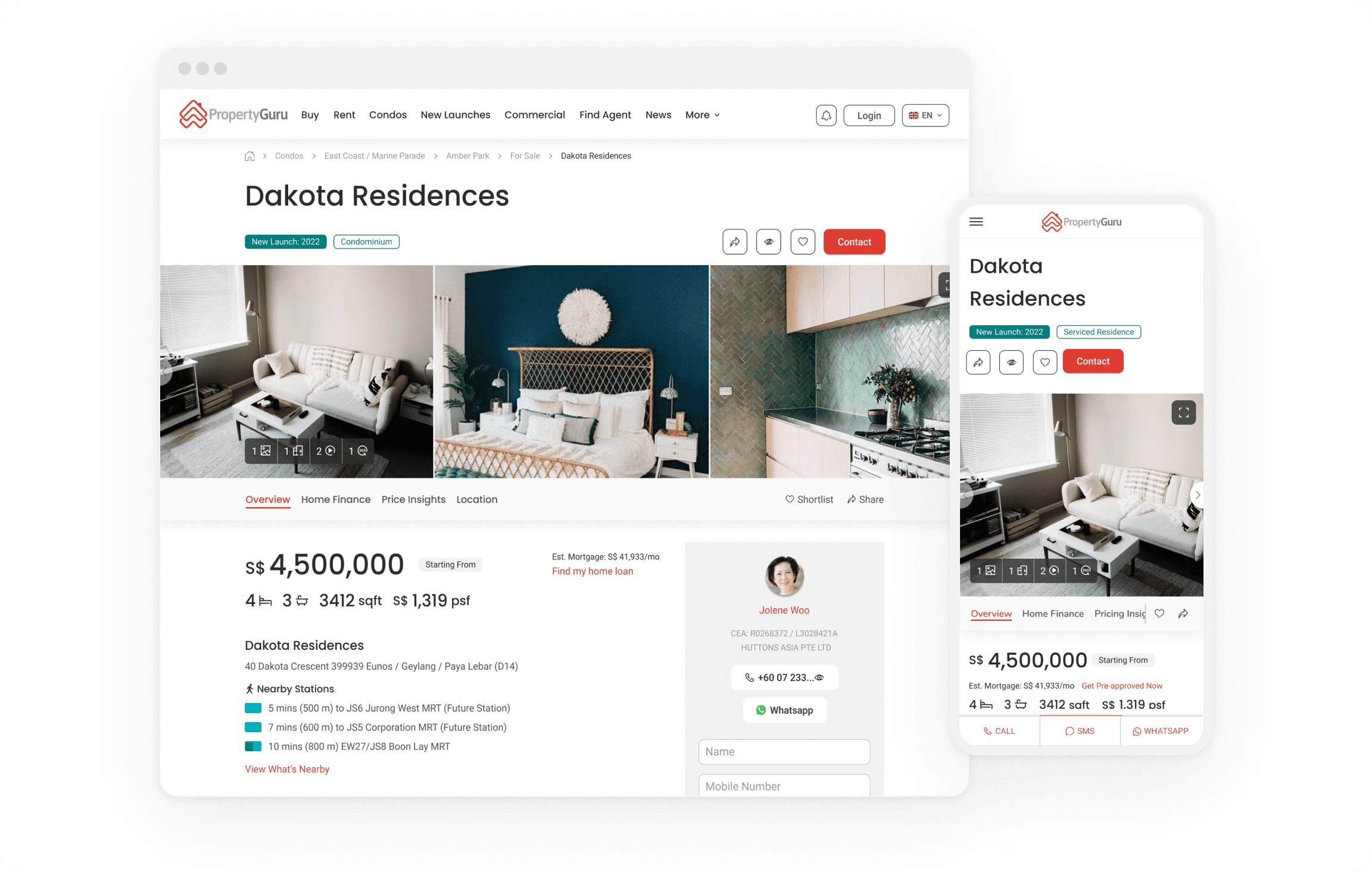
Old LDP on web desktop and web mobile
We learnt from past research that LDP contains irrelevant information for most people
Consumers don't use all of the Listing Detail Page and the information used varies depending of their needs. Consumers behaviour often involves quick skimming - suggesting ingrained habits.
Evidence of consumers looking outside of PropertyGuru to make next-step decisions when the information is actually present on the page:
…but cannot be found
…but not as intuitive to use
…but cannot be trusted
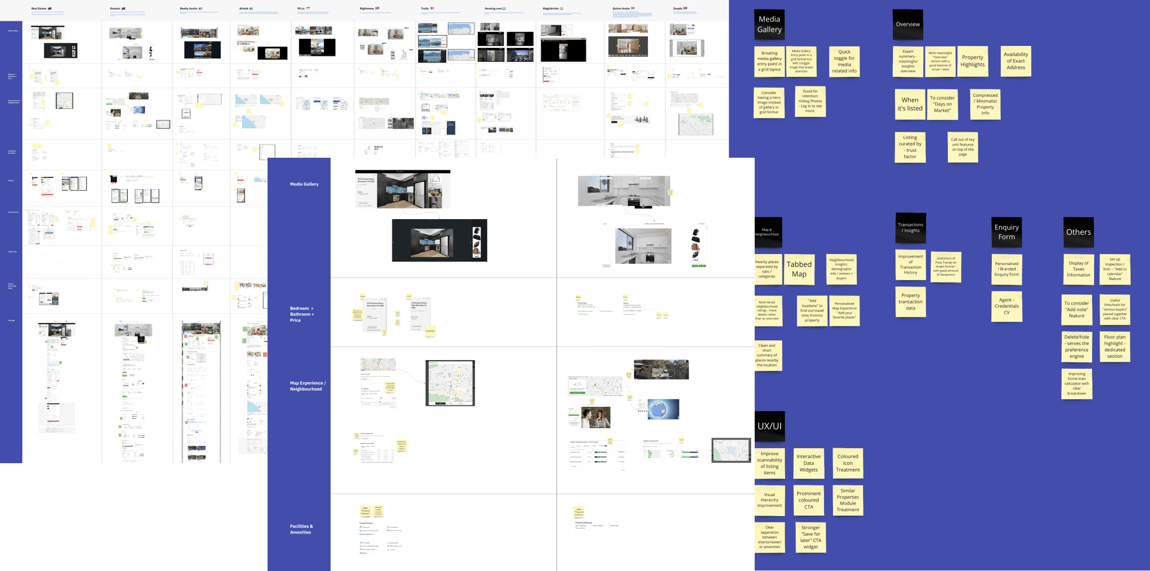
Collaboratively, we benchmarked and evaluated opportunities
Once we had more clarity of the problems on the LDP and past learnings, we decided to get everyone onboard. This was the very first workshop we ran in collaboration with other teams for the project.
The objective was to go through several other products and zoom-in on specific experiences. Starting from there, write down as much as they could what they like and what they didn't like.
We compiled all the insights and categorise in opportunities. From these opportunities we started figuring out prioritisation based on our personas in case. That was also important to us to be clear what good looks like.
Getting early feedback from consumers
After a few explorations, we believed that was sufficient to test and validate our hypothesis.
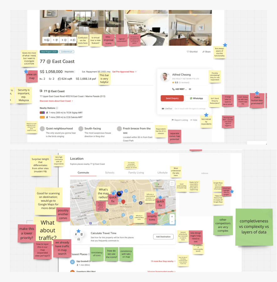
As part of our design process, we conducted user interview on a prototype.
We managed to hear from a few home seekers within a week. As a regular practice, we regrouped after the sessions to consolidate all the findings, together.
Fundamentally, the insights guided us to iterate more confidently.
Early test with consumers
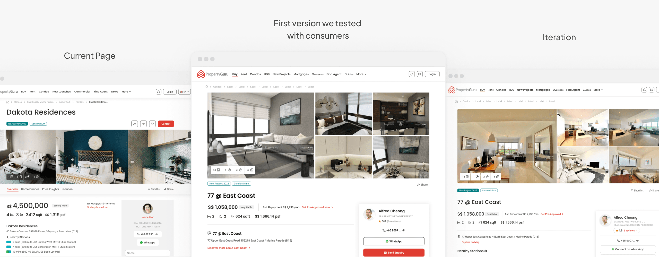
Iterating on specific experiences
Listing Detail Page contains a lot of information and features on its own. As part of our the process, we iterate and conducted user research to validate our hypothesis on specific experiences.
The challenges and learnings along the design process
🌏
LDP is shared across 4 different markets and 4 languages (English, Bahasa Malaysian, Bahasa Indonesia and Thai)
We had to take in consideration the impact those languages and respective translations in the experience. It was a bumpy process till we managed to have all the texts along with the design hand-off.
🔦
Lack of documentation and standardisation
We encountered scenarios where there was no documentation and the source of truth was actually the version in production. So I started to document and standardising all currency and metric related things as well.
🧩
Shareable Template
LDP is essentially a view from Agents Listings. However, we also have listings from Property Developers, and that's called Project Listing Detail Page ("PLDP"). From a Tech and Experience perspective, it makes sense that LDP and PLDP share the same components altogether. Of course, there are some intricacies from both pages and that's totally fine.
🎛️
Change in the Leadership followed by updates on the design system
The initial agreement with Product and Tech was to look at the experience and work with existing design components from our design system. However, during the redesign process, there was a change in the leadership followed by new directions and narratives. Due to that, we had to relook at a few aspects in our visual language and user experience. We're still gradually updating our UI based on that.
👨🔬
A/B Testing before full release
We made a decision to first release the new Listing Detail Page only in Singapore and A/B Test with the current version. Utilising Microsoft Clarity, I was able to observe user's behaviour on the page and that help us to identify and fix bugs early.
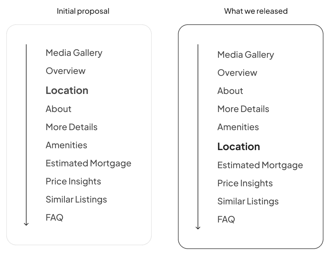
Tackling page structure
Previously, the information architecture wasn't optimised and location feature was placed towards the end of the page.
As part of our new narrative, property's location, as an experience on its own, should be positioned on top of the page for ease decision making. And that was something we were testing and validating with consumers.
However, when we were A/B testing, we realised that such change in positioning was also reflecting on the cost of the map — but more than we were expecting. And because of that, we made a decision to reposition the feature without drastically compromising the new experience.
The new experience
Better storytelling and enhanced user experience for ease of decision making
🔎 New information architecture. Because we also optimised the visual hierarchy, navigating on a Listing Detail Page now is easier and faster.
💺 More contextual and friendlier. The very first step to get to a more personalised experience.
🧱 Content sections are modular. That also enables different teams to experiment on the page more efficiently.
🖼️ Refreshed UI. We are also gradually updating our visual language across the product.
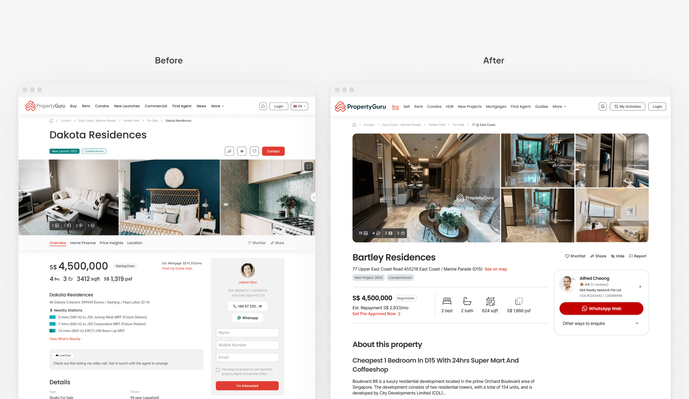
Comparison between old and new desktop versions
Before
After
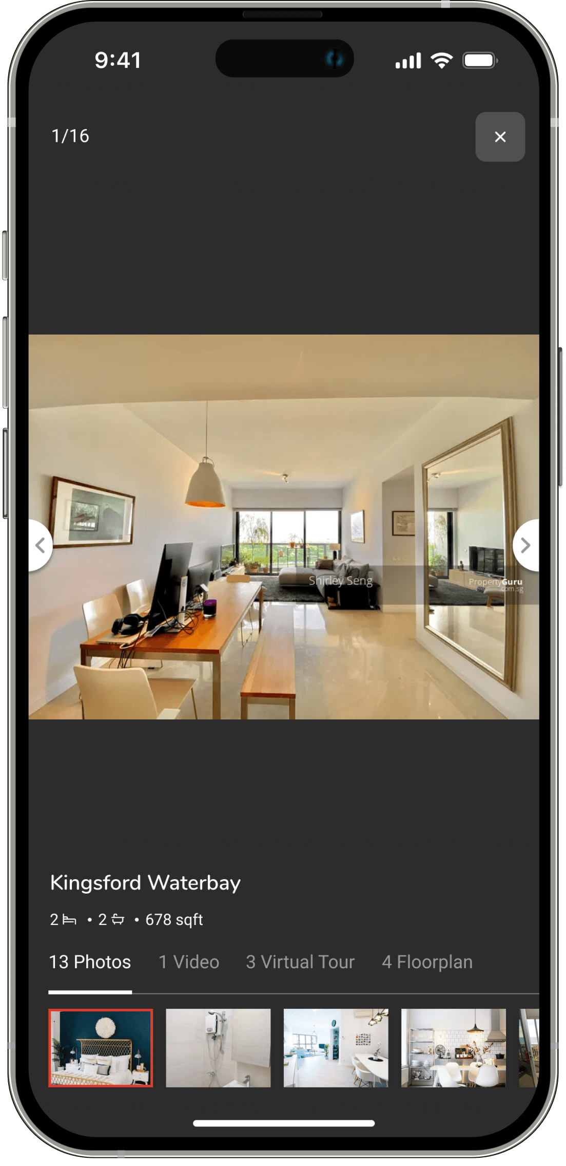
Optimizing media gallery and explorer
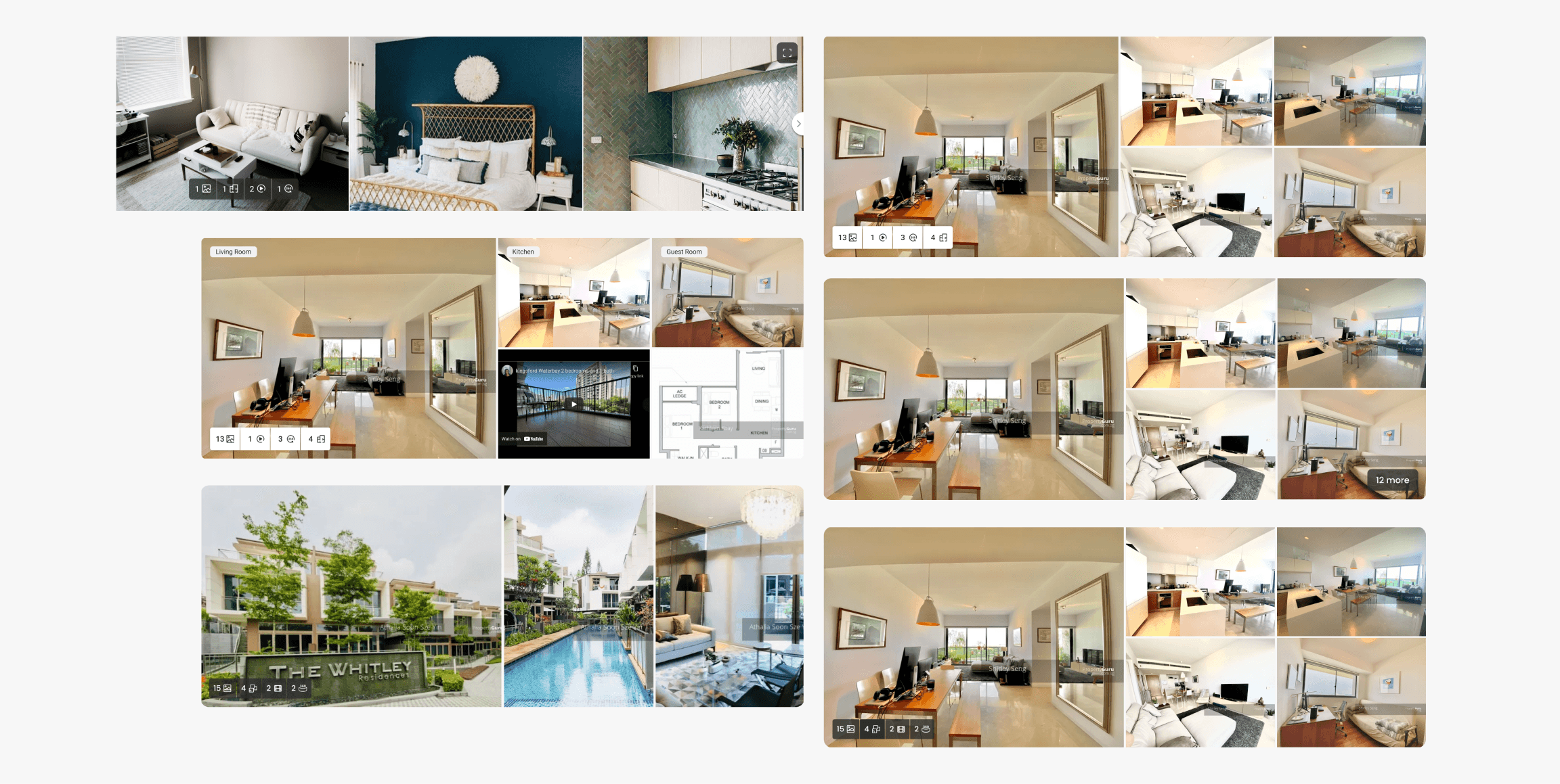
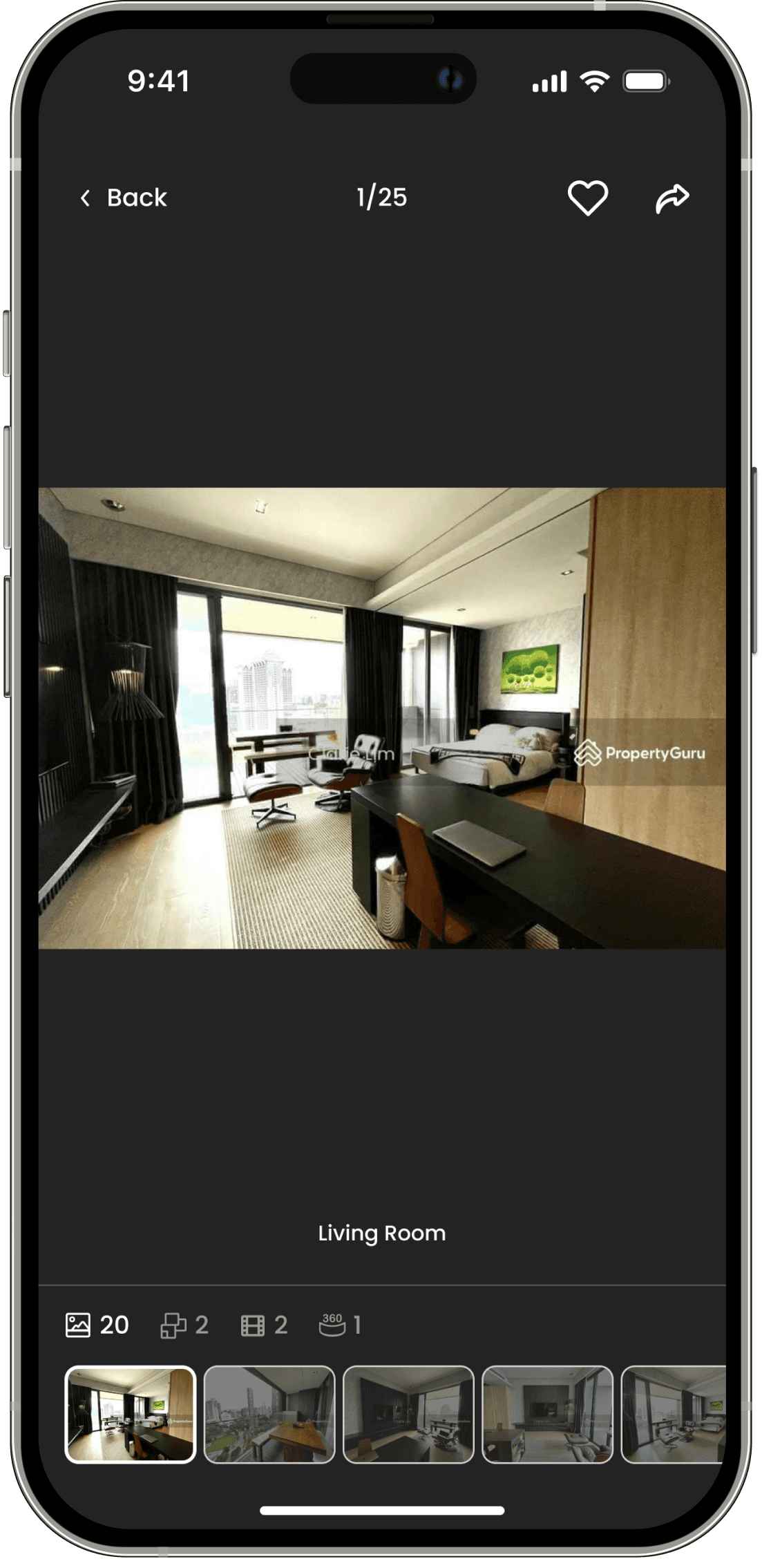
On desktop, we now surface more images consistently which also gives more space and opportunity for experimentation.
Captions allows consumers to easily identify property's rooms. We also surfaced the iconography, indicating media type just like the gallery for more affordance.
Media Gallery experience was often mentioned times during our benchmarking session and there was an opportunity for improvement. We explored different ways to display the media indicator as well as media formats.
Old media gallery and other explorations
Decluttering and enhancing enquiry experience for ease decision making
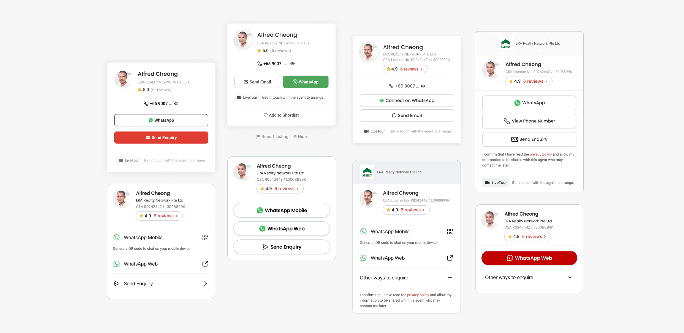
From a product point-of-view, we want to give consumers as many options as possible so then they can reach out to an agent. But that also means cluttering and adding more complexity when enquiring.
Since the start of the project till now, we have been experiment and evolving the enquiry experience. Our intention is to anchor consumers and reduce friction.
Enquiry Bar on Desktop iterations
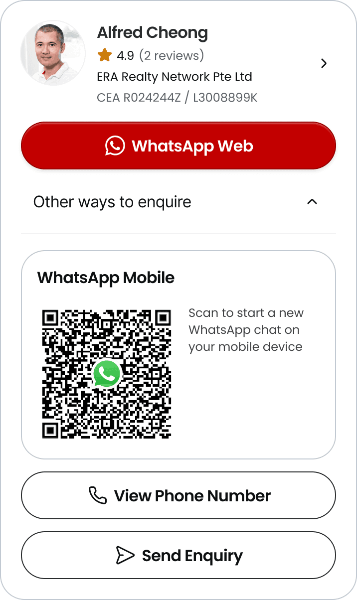
Simplifying Enquiry Experience on Desktop
Evidences shown that most of our consumers on web desktop enquire via WhatsApp or Phone Number.
Evidences shown that most of our consumers on desktop enquire via WhatsApp the most followed by Phone Number.
Consumer can now scan a QR code to start a conversation with Agent on their mobile.
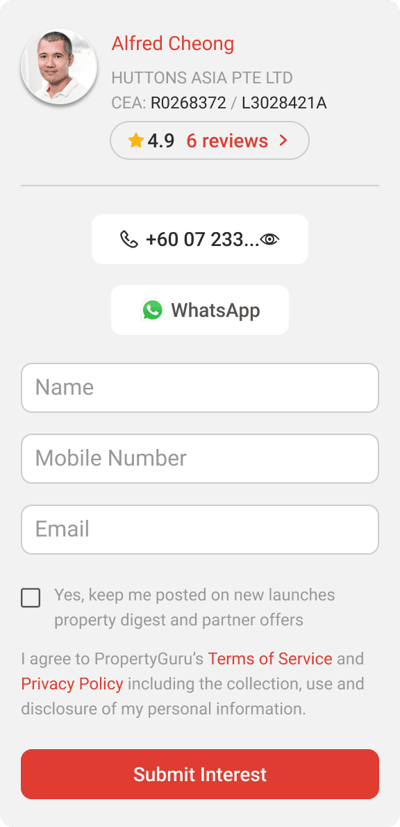
Before
After
Focusing on scaling
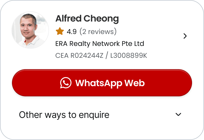
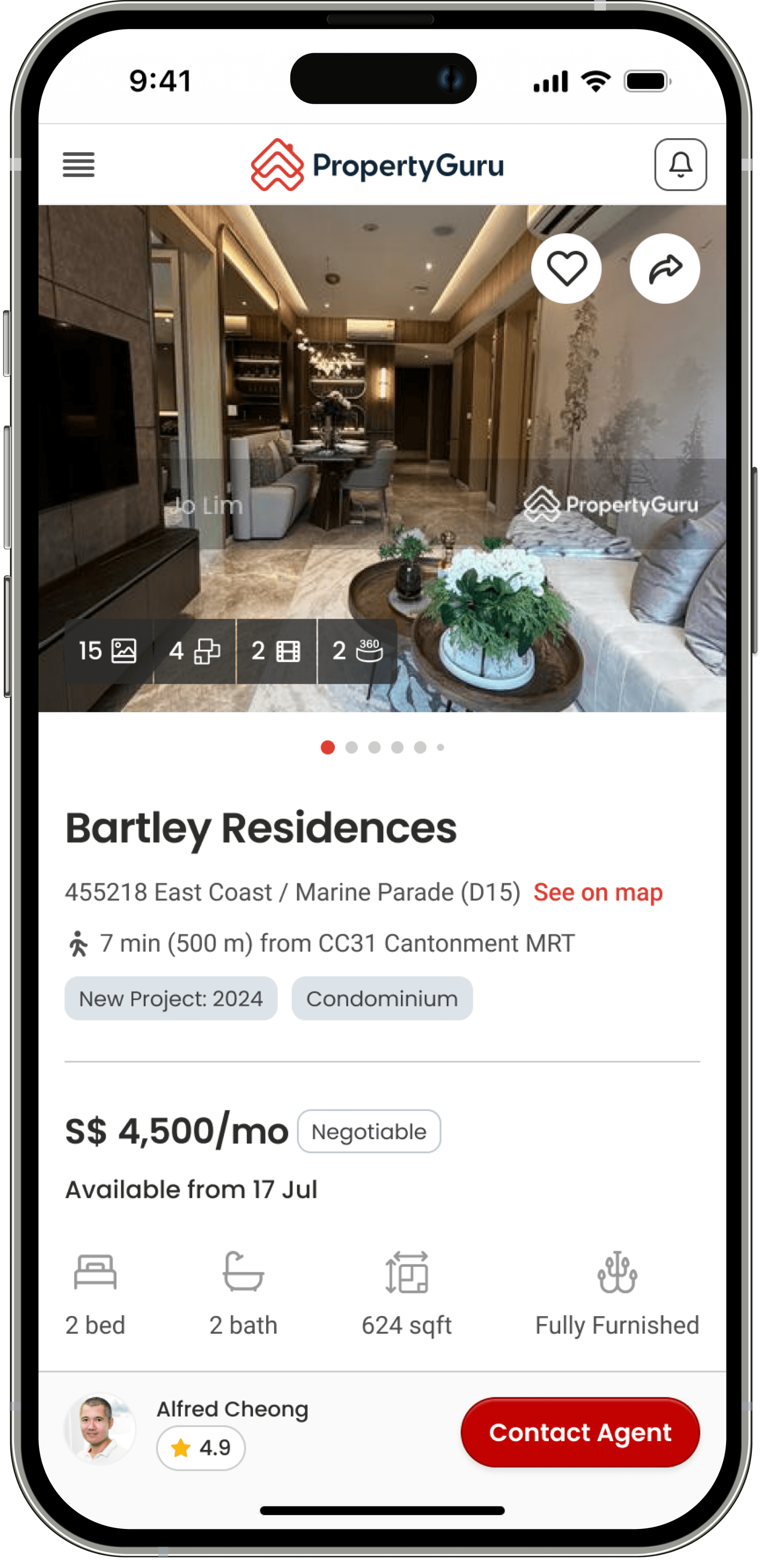
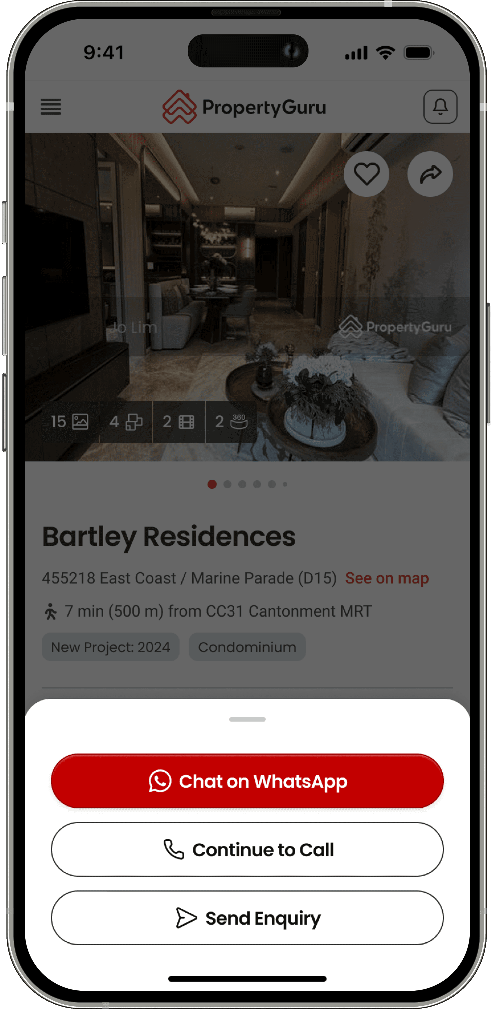
On mobile, we decided to go with 2-taps experience.
📐 It's scalable. Previously, enquiry methods were exposed and due to that, we weren't enable to surface other informations such as agent's rating. We're also experimenting other features within the enquiry.
📝 Terms and conditions. When we first introduced Leads Management, consumers had to be informed that agents could possibly contact them. This piece of "legal copy" was placed right there for transparency right before enquiring.
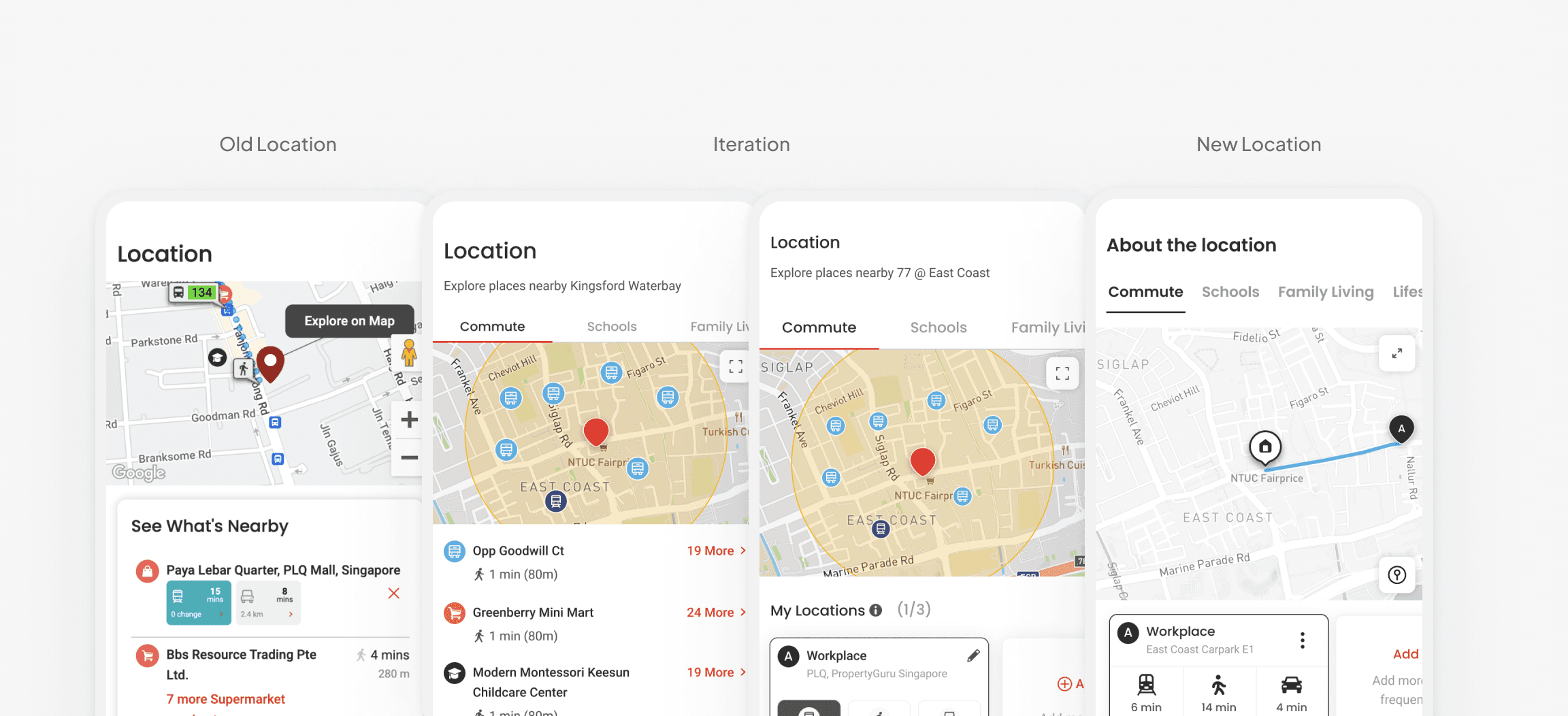
Improving experience and visibility of property's location and its surroundings
From past research, there was enough evidence that location is one of the key criteria for decision making from property seekers.
Consumer from different countries were looking at location for different reasons. In Singapore, for instance, 1 km radius from the property to points-of-interest such as Primary Schools, MRT Stations as well as Bus Stop is pretty standard. Especially knowing that benefits from the government, usually, also take such measurement as reference.
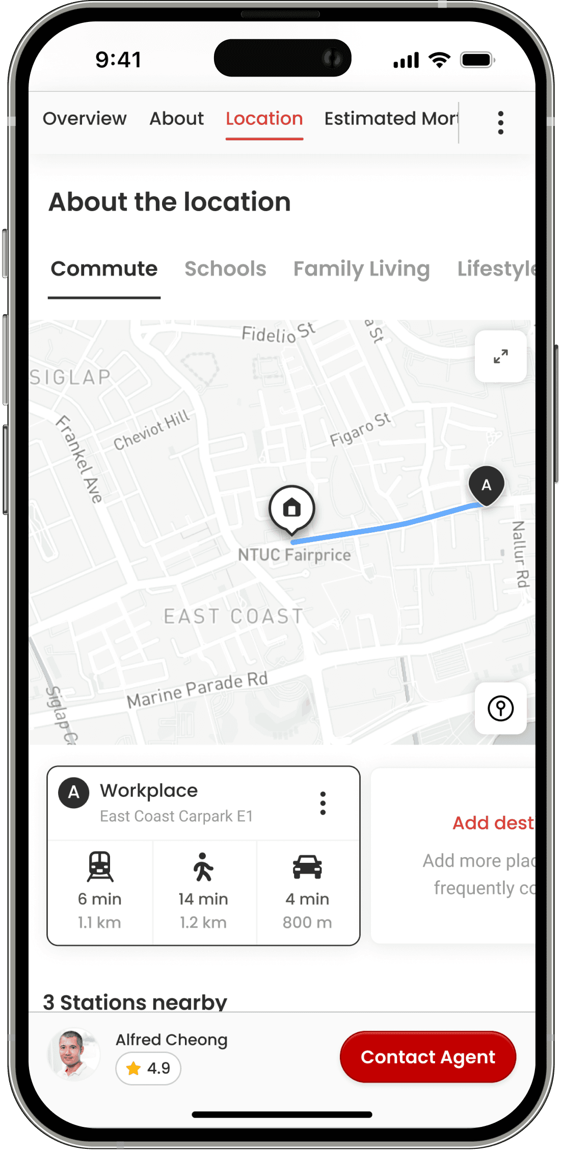
Commute Experience
Consumers can also easily add their frequent destinations and visualise its commuting time. The information will available on all Listing Detail Page.
Enhancing Point-of-Interest and Expanded View
Surfacing more details. Previously, it was a hard for consumers to get more information such as walking distance from the property to the places.
Enhancing data visualisation and interaction on Price Insights
We redesigned the entire widget so consumers who are casually browsing (one of our personas) can see the information they need in a glance. For those home seekers who are looking for more transaction details, they can expand and explore with ease as well.
Results
01
In Singapore, conversion increased by 3%. The time spent on the page was 7% quicker. In Malaysia the conversion uplift was higher, 11%.
02
In Malaysia the conversion uplift was higher, 11%.
This was just the very first step on improving not only conversion but overall user experience on Listing Detail Page.
Because of the entire re-structure on the tech side of things, we can also test, validate and ship faster.
