Maybank, 2019
App
My Role
Product Designer
Key Activities
User Research
Visual Design
Test and Validation
Prototyping
Overview
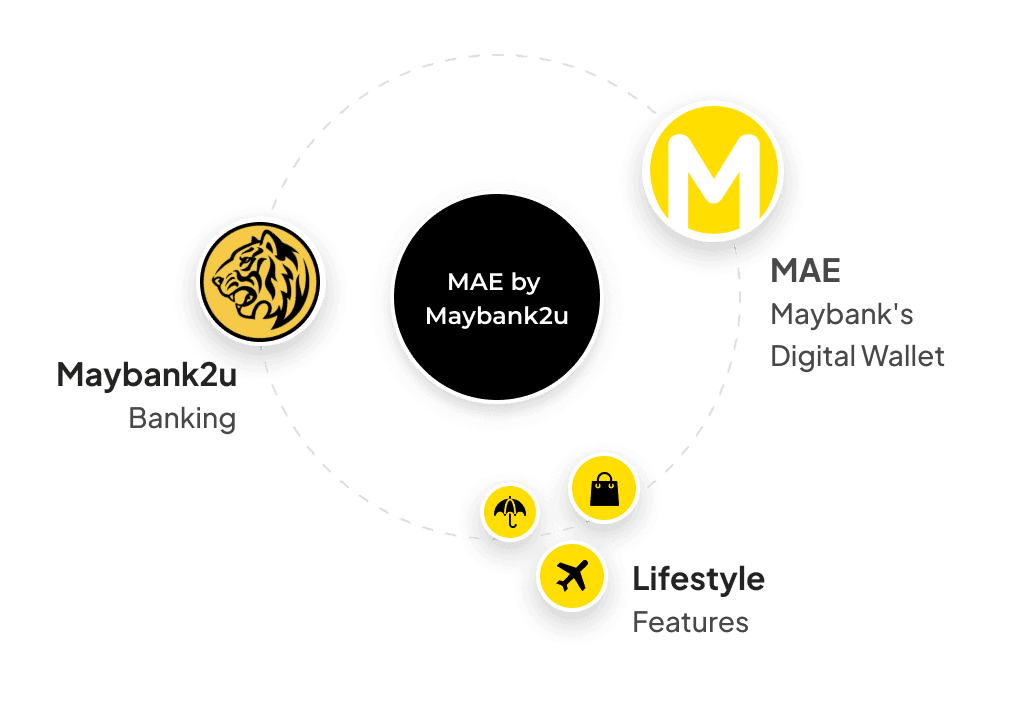
Maybank is Malaysia's largest bank, operating throughout the country and broader region. Before MAE by Maybank2u was released, Maybank2u App was Maybank's online banking system where customers could engage and manage their money — the most convenient and reliable internet banking.
However, Maybank wanted to take a step further enabling customers to also manage their lifestyle needs all-in-one application. That was when MAE by Maybank2u was conceptualised.
Though I led other experiences like Expenses Management & Bill Payment, for this particular case study I'm only covering the design of the Dashboard.
The problem
App should enable both existing and non customers to benefit of its banking and lifestyle features
Maybank wanted to make sure customers that were using its digital wallet, MAE, would continue benefiting fully. But also, attracting non customers to sign up for a new account and get onboarded seamlessly.
Leveraging on payments via QR code
01
Small businesses were starting to adopt Maybank QRPay as their cashless payment method instead of the usual credit/debit card terminals.
02
That opened up a lot of opportunities, especially for the Food & Beverage. It originated a lifestyle featured named “Food near me". Consumers could look up for bars and restaurant around them that accepted QRPay (as an option). They also could “spin the wheel” and MAE By Maybank2u would suggest a place.
Addressing consumer's pain points
Current internet banking was pretty efficient when we the subject was purely banking. However, they couldn’t manage their expense well. They also were looking for ways to save money efficiently. Expenses, Tabung and other features like Split Bill would became part of the new experience.
Exploring and defining the visual direction
We were able to expand the colour palette to more vibrant and friendly tones.
Even though Maybank has an established identity and visual direction, we had the freedom to explore and propose a different approach for the app.
We partnered and collaborated with a digital agency and they were able to help us with the illustrations as well.
They delivered several sets of illustrations where we could build and customise illustrations for different experiences as needed.
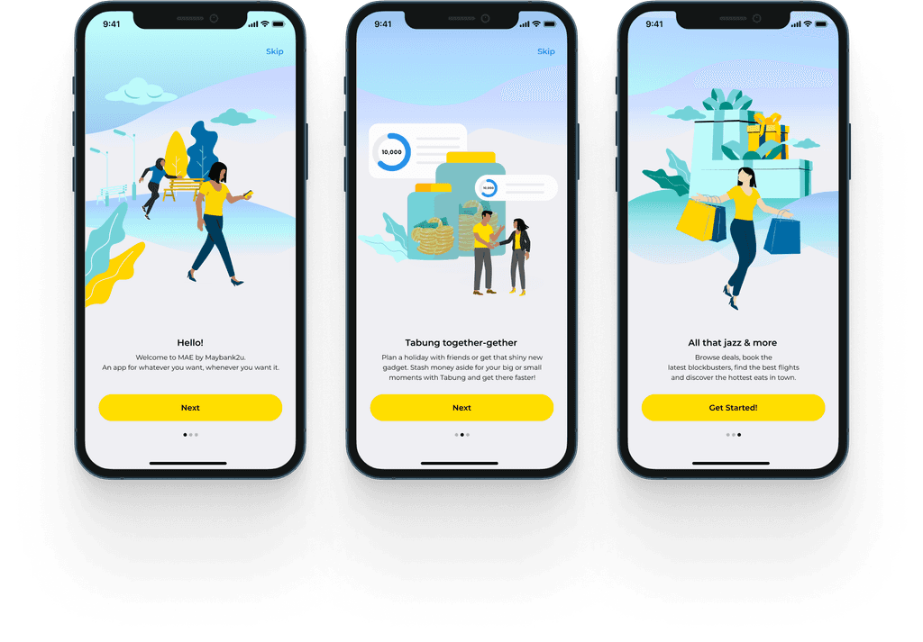
Example of Illustrations used on the onboarding experience
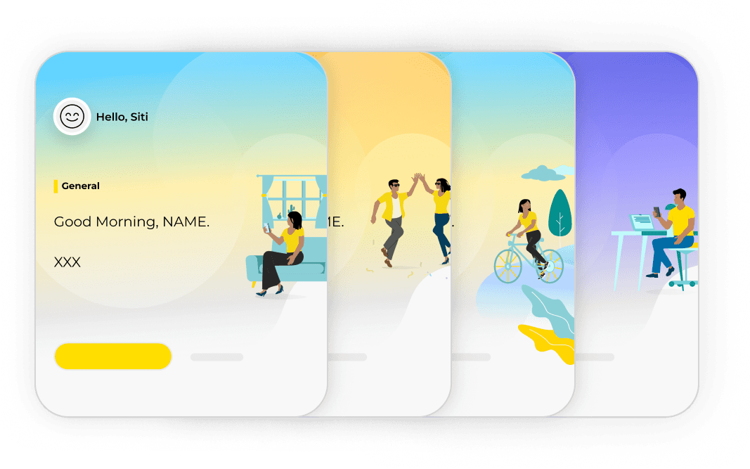
It's essentially a feature that acts like a personal assistant where it could understand customer's needs and providing insights when possible. Each "Moment" was essentially a different feature where the customer could have interacted or not, tailored to individuals.
Templates and iterations of Moments feature
Together, we managed to design dozens of possibilities. The idea was to come up with as many scenarios as possible, thinking in a long term vision.
It was important for us that users could distinguish each moment clearly. Visually, we decided to attribute specific colours for each vertical. Illustrations were also utilised to create a more contextual and playful experience.
To facilitate the process and visualisation, I created templates on Figma so the UX Writer could easily make changes. Back then, the team was using Sketch as main design tool.
That was probably the hardest step on this process.
The concept of the dashboard was never to sell Maybank Products for its customers, quite the contrary. It should be a place where consumers could easily find what they are looking for their banking and lifestyle needs.
”Moments” was a great part of the experience which would aggregate features based on user's behaviour - but that wasn't enough. When we start iterating, we realised the banking features were becoming less prominent and somewhat hidden.
01
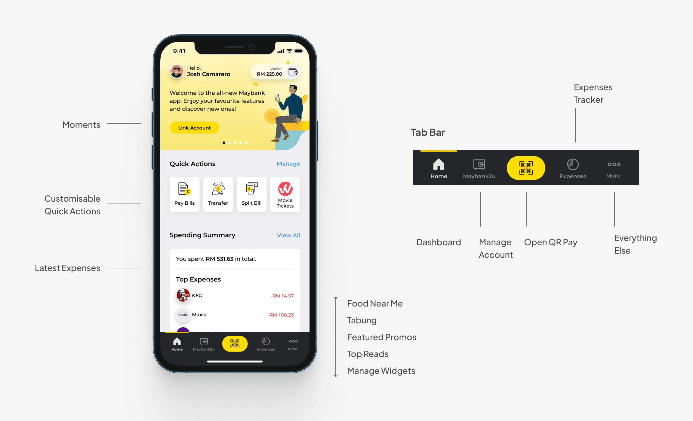
Consumers should be able to easily interact with certain features based on their own needs - they should be able to customise their own dashboard.
02
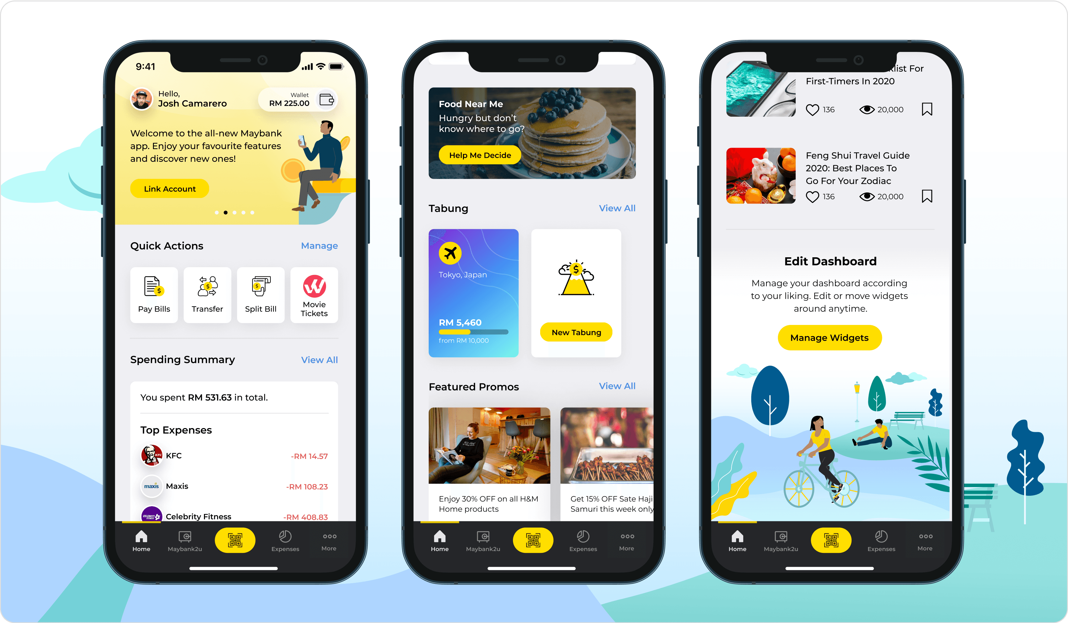
Quick Actions help users to manage their banking and lifestyle needs. They are able to easily decide what actions are more important to them and such will be accessible one tap away.
Summary of the expenses with ease. That means without having to go through a couple of security steps just to get a good glance. For privacy and security issues, we decide afterwards that users could hide such information and just display when they feel safe to do so.
On Maybank2u tab, customers are able to manage their multiple accounts just like they used to. That's where they can also manage their credit card and loans. All within one tab.
As mentioned, QRPay was a big product on its own and the most convenient way to make payments — for both merchants and customers.
An entry point for both Food Near Me and Tabung were essential to create awareness and entice consumers to explore.
We gave consumers the control of their own dashboard. They are able to manage the widget based on their personal needs.
As a matter of fact, a few of the lifestyle features present in the app are powered by partners. Maybank customers could enjoy of benefits such as discounts from certain merchants which could be found in specific vertical and highlighted on the dashboard.
Learnings
This was my first time working for a Fintech. Due to the size of the organisation, it was a very eye-opening and challenging experience. It was extremely important to keep stakeholders on the same page for a more smooth process.
Even though our intent was to become a lifestyle app, the core features from a banking app should be extremely evident for those consumers who were used to the “classic” version of Maybank2u.
The App was released in the midst of covid and it was well received by the public back then. Unfortunately, I was no longer part of the team therefore I couldn't get more data and success metrics.

